Demo 9 Project (TabBar)
Display a toolbar at the bottom of your iOS device. Tap toobar items to send commands.
What you will see
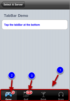
This demo shows you how to add a tabar (1, above) to a view. When the view is launched, it shows a parent view and a tapBar at the bottom. The tabBar contains four custom toolbar items. Two of them are assigned a badge (2, 3 above). Tabbar provides a way for grouping related sub views together and a convenient way to hop between them.
Try tapping the buttons.
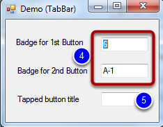
The badge values of the first two tabBar buttons are controlled by the Windows Demo application (4, above). Try change the value on the two text fields then refresh the view on your iOS device to test.
The last text field shows the title of the tapped tabBar button.
Highlights of the code
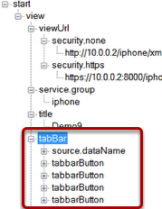
On the iQuipment PC, open the demo9.xml file. Click the "tabBar" node to expand it and you will see four "tabBarButton" sub nodes (1, above). Expand each sub node and you will see the source of the icon file, title, url and badge. The "url" sub node determines which view will be loaded when the button is tapped. The "badge" sub node contains an exposed variable "badge1" or "badge2." If you open Form1.cs of Demo 9 project on Visual Studio, you will see the two text fields on the Windows demo application actually control the badge values of the first two buttons (see below).
const string ExVariable_badge_1 = "badge 1";
const string ExVariable_badge_2 = "badge 2";
...
private void textBox_badge_1_TextChanged(object sender, EventArgs e)
{
INFOMATO.WCF.DataExchangeService.servicePostData(myViewName, ExVariable_badge_1, textBox_badge_1.Text);
}
private void textBox_badge_2_TextChanged(object sender, EventArgs e)
{
INFOMATO.WCF.DataExchangeService.servicePostData(myViewName, ExVariable_badge_2, textBox_badge_2.Text);
}